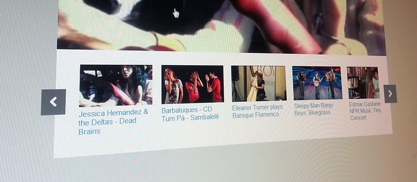
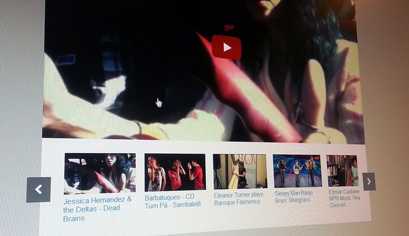
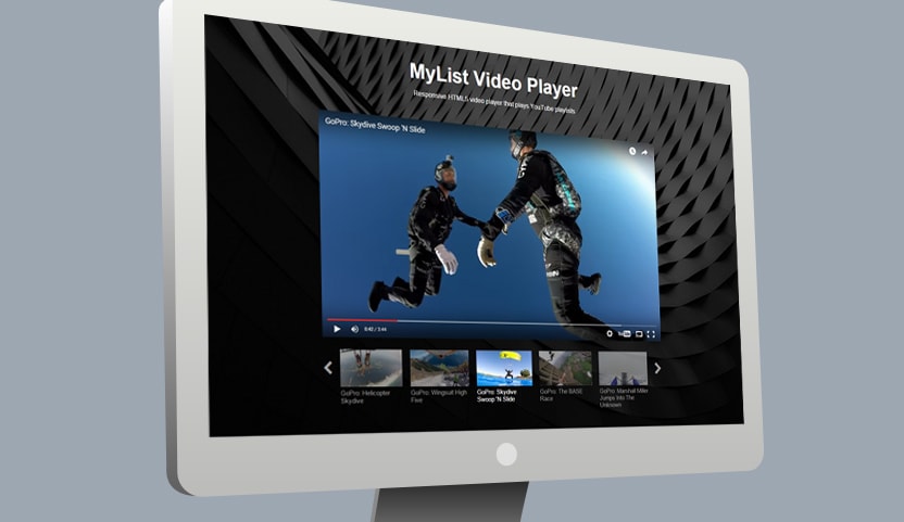
In this post we will work with an embedded YouTube video player using YouTube’s iframe embed code. Below the iframe we’ll add a horizontal playlist that includes a thumbnail image and title for each video. The playlist will scroll or slide left and right on click or tap.
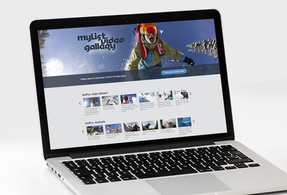
The player we are building in this is based on the MyList Video Player, but instead of automatically populating with a YouTube playlist, we are manually building our own playlist of selected YouTube videos.
Since we are using YouTube’s iframe embed code it should work on all devices and serve up either the flash or HTML5 player automatically. We’ll also ensure it’s responsive by using percent widths and some basic media queries.
The Player
First we need to embed the YouTube player using the iframe embed code. Give the iframe an id of “vid_frame”. We’ll wrap the iframe in a div with a class of “vid-container”. Later we’ll use the CSS properties for both to control the layout and ensure responsiveness.
<div class="vid-container">
	<iframe id="vid_frame" src="http://www.youtube.com/embed/eg6kNoJmzkY?rel=0&showinfo=0&autohide=1" width="560" height="315" frameborder="0"></iframe>
</div>
The Playlist
Each video in our playlist will have a thumbnail image placed inside a div with class of “thumb” and a description placed in a div with class of “desc”. These are both contained in a div with class of “vid-item”. In this case I decided to use YouTube’s auto-generated poster image for the thumbnail images. You can get these using the URL “http://img.youtube.com/vi/” followed by the video ID and the image file name. My first video has an ID of “eg6kNoJmzkY” and I want to use the first poster image so I set my img src to “http://img.youtube.com/vi/eg6kNoJmzkY/0.jpg”. You can also try “1.jpg”, “2.jpg”, “3.jpg”.
<div class="vid-item">
  <div class="thumb">
  	<img src="http://img.youtube.com/vi/eg6kNoJmzkY/0.jpg">
  </div>
  <div class="desc">
  	Jessica Hernandez & the Deltas - Dead Brains
  </div>
</div>
Updating iframe src on click
We want the YouTube player to load and play the selected video. To accomplish this we add an onClick property to the “vid-item” as follows:
<div class="vid-item" onClick="document.getElementById('vid_frame').src='http://youtube.com/embed/eg6kNoJmzkY?autoplay=1&rel=0&showinfo=0&autohide=1'">
This simply looks for the iframe and sets it’s src to the specified URL. Obviously you want to use the URL to the corresponding YouTube video. Add “?autoplay=1” to ensure that the video starts playing automatically. The other parameters “rel”, “showinfo” and “autohide” are not necessary.
You should now have one video in your playlist with the code looking like this:
<div class="vid-item" onClick="document.getElementById('vid_frame').src='http://youtube.com/embed/eg6kNoJmzkY?autoplay=1&rel=0&showinfo=0&autohide=1'">
	<div class="thumb">
		<img src="http://img.youtube.com/vi/eg6kNoJmzkY/0.jpg" alt="" />
	</div>
	<div class="desc">
		Jessica Hernandez & the Deltas - Dead Brains
	</div>
</div>
Simply copy and paste this and update the onClick, thumbnail img src, and description for each video in your playlist. Then wrap your playlist in a div with class of “vid-list”. Wrap the whole thing in another div with class of “vid-list-container”.
Left and Right Arrows
Below the playlist code add the Left & Right arrow buttons with the following code:
<div class="arrows">
	<div class="arrow-left">
		<i class="fa fa-chevron-left fa-lg"></i>
	</div>
	<div class="arrow-right">
		<i class="fa fa-chevron-right fa-lg"></i>
	</div>
</div>
Here I am using Font Awesome’s chevron icon for the left and right arrows. Font Awesome icons are embedded using an <i> tag with specific classes. In order for this to work we’ll need to download and link to the font-awesome css file in the <head> with <link rel=”stylesheet” href=”css/font-awesome.min.css” >
The CSS
Responsive YouTube Embed
Using a little trick I picked up from John Surdakowski we can make the YouTube embed code responsive. Specify postion:relative and a 50% to 60% padding-bottom for the .vid-container div. Then specify positoin:absolute and with and height of 100% for the iframe, object and embed child elements.
.vid-container {
	position: relative;
	padding-bottom: 52%;
	padding-top: 30px;
	height: 0;
}

.vid-container iframe,
.vid-container object,
.vid-container embed {
	position: absolute;
	top: 0;
	left: 0;
	width: 100%;
	height: 100%;
}
Styling the playlist
Specify an overflow of hidden for the outer vid-list-container div. Then specify a width for the inner vid-list div. The vid-list width will depend on how many videos are in your playlist. In this case the width of each item in the vid-list is 168px. So just multiply the total number of videos in your list by 168 to get your vid-list width.
.vid-list-container {
	width: 92%;
	overflow: hidden;
	margin-top: 20px;
	margin-left:4%;
	padding-bottom: 20px;
}

.vid-list {
	width: 1344px;
	position: relative;
	top:0;
	left: 0;
}
Pretty standard CSS for the rest of the playlist to get a horizontal row of divs – each containing a thumbnail and description. To control the size and spacing, specify a width and padding for the .vid-item. Then specify 100% width for the .thumb img.
.vid-item {
	display: block;
	width: 148px;
	height: 148px;
	float: left;
	margin: 0;
	padding: 10px;
}

.thumb {
	overflow:hidden;
	height: 84px;
}

.thumb img {
	width: 100%;
	position: relative;
	top: -13px;
}

.vid-item .desc {
	color: #21A1D2;
	font-size: 15px;
	margin-top:5px;
}
Positioning the Left & Right Arrows
In order to have the left and right arrows overlap the left and right edges specify position:relative for the .arrows container and position:absolute for the .arrow-left and .arrow-right elements. Then specify left and top positions for both .arrow-left and .arrow-right to get them positioned in just the right spot.
.arrows {
	position:relative;
	width: 100%;
}

.arrow-left {
	color: #fff;
	position: absolute;
	background: #777;
	padding: 15px;
	left: -25px;
	top: -130px;
	z-index: 99;
	cursor: pointer;
}

.arrow-right {
	color: #fff;
	position: absolute;
	background: #777;
	padding: 15px;
	right: -25px;
	top: -130px;
	z-index:100;
	cursor: pointer;
}
Reposition left & right arrows on small screens
Use a media query and specify new styles for the arrow elements to reposition them on smaller screens:
@media (max-width: 624px) {
	.arrows {
		position:relative;
		margin: 0 auto;
		width:96px;
	}
	.arrow-left {
		left: 0;
		top: -20px;
	}

	.arrow-right {
		right: 0;
		top: -20px;
	}
}
The Javascript
Finally we’ll add some javascript (that relies on jQuery) to scroll our playlist left and right on click of the arrows:
$(document).ready(function () {
    $(".arrow-right").bind("click", function (event) {
        event.preventDefault();
        $(".vid-list-container").stop().animate({
            scrollLeft: "+=336"
        }, 750);
    });
    $(".arrow-left").bind("click", function (event) {
        event.preventDefault();
        $(".vid-list-container").stop().animate({
            scrollLeft: "-=336"
        }, 750);
    });
});
I don’t want it to scroll too far on small screens. So I’ve set it to scroll 336 pixels which equals the width of two .vid-items.
Check out the demo and view it’s source code for the full picture.
Check out the new MyList Video Gallery.
A fully responsive Youtube video gallery featuring scrolling thumbnail playlists. Uses latest YouTube API (V3) and dynamically loads YouTube playlists. Easily add multiple playlists to your webpage to create a video gallery. Videos open and play in a full-screen YouTube player.

